Design Systems · APR 4, 2026
Figma MCP vs Paper MCP: I designed the same dashboard in both — here's what happened
A head-to-head comparison of Figma and Paper's MCP servers in Claude Code. Same prompt, same dashboard, two different design engines — with setup instructions, the exact prompt, and an honest breakdown of which one produces better AI-designed UIs.
The Figma version (desktop). Open both files above to compare side-by-side.
What we're building and why two MCPs
I gave Claude Code one prompt and had it design a finance tracking dashboard in two design tools simultaneously — Paper and Figma. Both have MCP servers that let Claude read and write to their canvas. Same prompt, same data, two different engines.
The goal was to test which MCP gives Claude more creative range and produces higher quality output. Not in theory — by running them head-to-head on the same design task and comparing what came out.
The result: 4 artboards total — a desktop (1440px) and iOS (390px) version in each tool, plus shader-inspired visual effects, progress bars, and a liquid-morphing logo. Open both design files above and follow along.
Setup: Paper MCP (5 minutes)
Download Paper
Paper is free to start (100 MCP calls/week on the free tier). Grab the desktop app:
paper.design/downloads — available for macOS, Windows, and Linux.
Open a file
Create or open any design file. This automatically starts the MCP server on localhost:29979. No configuration needed in Paper itself.
Connect Claude Code
Run this in your terminal:
claude mcp add paper --transport http http://127.0.0.1:29979/mcp --scope userClaude Code now has 24 tools to create artboards, write HTML into your canvas, take screenshots, update styles, and more.
Verify
Open Claude Code and type /mcp. You should see paper listed. If Paper is running with a file open, you're good.
Setup: Figma MCP (5 minutes)
Connect Claude Code to Figma's remote server
The easiest setup uses Figma's hosted MCP server:
claude mcp add figma --transport sse https://mcp.figma.com/sseWhen Claude Code starts, it will prompt you to authorize access. Click "Allow Access" and you're connected.
Alternative: Desktop server
If you prefer local: open Figma Desktop, press Shift+D for Dev Mode, and toggle "Enable desktop MCP server" in the inspect panel. The server runs at localhost:3845.
The prompt
Here's the exact prompt I used. It tells Claude to use both MCPs at the same time, and to leverage the skills and tools each MCP provides — not just the basic ones:
I want you to create a finance tracking dashboard app. Make it light mode, use modern fonts, no emojis. You should use all the relevant skills and tools available to you with the Figma or the Paper MCP so that this design is not generic, cookie-cutter.

Page details:
On the page, show my total monthly spend up top, then a list of expenses below, and then a way to sort the list by 3 categories.

Make this with the paper MCP and the Figma MCP at the same time. Be sure to use all the relevant skills available to you with the MCPs you have.
The key phrase is "use all the relevant skills and tools available to you." This pushes Claude past basic rectangles-and-text into using font lookups, computed styles, screenshot-driven review cycles, and batch updates that most people don't know these MCPs support.
The results: Paper vs Figma
Both tools produced a working finance dashboard with the same structure: header with nav, total monthly spend hero, three category breakdown cards, filter pills, and an expense table with 7 rows. But the quality gap was immediately visible.
Paper's output (desktop + iOS)
Paper's dashboard landed with a mesh-gradient hero panel in deep purple and teal, color-coded stat cards with progress bars, a glowing active filter pill, and alternating row tints. The typography used Space Grotesk for numbers and Inter for body text — Claude chose these after checking font availability with get_font_family_info. The iOS version adapted naturally: horizontally scrollable stat cards, stacked expense rows with description and amount on top, badge and date below.
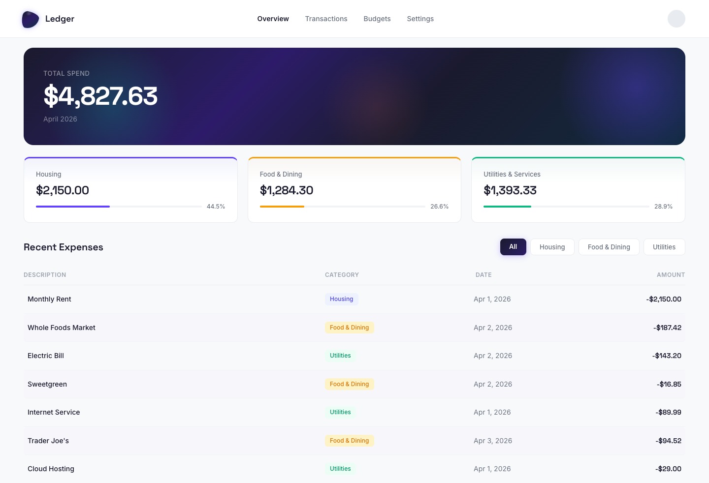
Paper — Desktop (1440px)
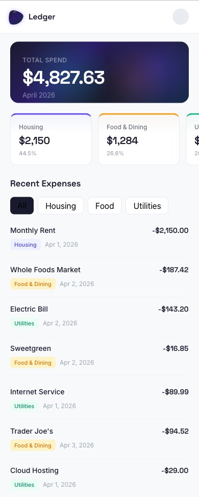
Paper — iOS (390px)
Open the Paper design to see both artboards.
Figma's output (desktop + iOS)
Figma's dashboard had the same structure but lacked the visual refinements. No gradient hero — just a plain summary section. The stat cards had no progress bars or color accents. The filter pills worked but the active state was a simple dark rectangle without the gradient glow. Amounts used Inter throughout instead of the Space Grotesk pairing that Paper got. The iOS version required multiple fix iterations to get the spacing right.
Open the Figma design to compare.
Figma MCP limitations I hit
The Figma MCP isn't bad — it works. But I ran into real friction that directly impacted design quality. Here are the specific issues I saw in both the desktop and mobile outputs:
Desktop: oversized elements and broken sizing
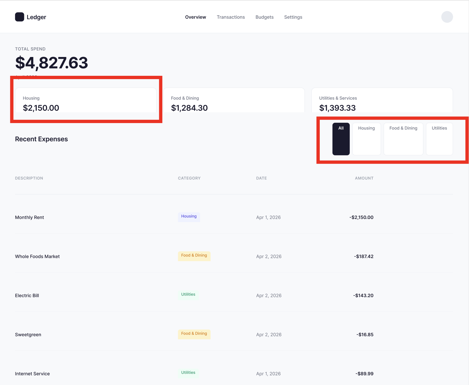
Figma desktop — Housing card height mismatch (left) and oversized filter pills (right)
The desktop version had two glaring issues. First, the Housing stat card had an inflated height — it was noticeably taller than the Food & Dining and Utilities cards sitting next to it, breaking the visual rhythm of the row. In Paper, all three cards sized identically because flex: 1 just works.
Second, the category filter pills were oversized. The "All" active pill in particular rendered as a tall dark rectangle instead of the compact pill shape that Paper produced. The inactive pills ("Housing," "Food & Dining," "Utilities") also had excess vertical padding, making the entire filter bar look chunky and unrefined.
Both issues trace to the same root cause: Figma's auto-layout sizing model. Setting layoutSizingHorizontal = 'FILL' and counterAxisSizingMode = 'AUTO' in the right order, after appendChild, is easy to get wrong — and Claude got it wrong on the first pass. It took additional fix iterations to tighten.
iOS: stat cards without visual polish
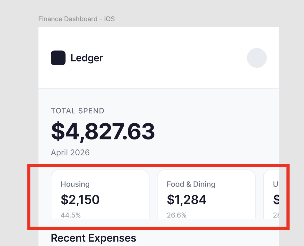
Figma iOS — plain stat cards vs Paper's color-coded, gradient-washed cards
The mobile version exposed another gap. Paper's stat cards had colored top borders (indigo, amber, green), subtle gradient washes, and percentage labels — all accomplished with one-line CSS like border-top: 3px solid #6342FF and background: linear-gradient(...).
Figma's stat cards were plain white boxes with a simple border. No color coding, no gradient accents, no progress bars. Not because Claude didn't want to add them — but because creating a gradient fill in Figma requires constructing a GradientPaint object with gradientTransform matrices and gradientStops arrays. That's significantly more code than writing background: linear-gradient(180deg, rgba(99,66,255,0.04) 0%, #FFFFFF 40%) in Paper.
MCP comparison: how they actually differ
Both MCPs let Claude read from and write to a design canvas. But they work fundamentally differently under the hood — and those differences directly caused the quality gap in the dashboard designs above.
| Capability | Paper MCP | Figma MCP |
|---|---|---|
| Canvas format | Real HTML/CSS — designs are code | Proprietary WebGL — requires translation |
| How Claude writes | write_html — direct HTML injection | use_figma — Plugin API JavaScript |
| Styling | Real CSS properties via update_styles | Figma's property model (fills, strokes, effects) |
| Code export | Built-in JSX + Tailwind via get_jsx | Code generation from design context |
| Batch operations | Native — text, styles, renames in one call | Manual loops in Plugin API scripts |
| Visual effects | GPU shaders (gradients, liquid, grain, halftone) | Not available via MCP |
| Design systems | Not yet | Full search + Code Connect mapping |
| Tool count | 24 tools | ~15 tools |
The simplest way to understand the difference: Paper's MCP gives Claude a steering wheel. Figma's gives it a window.
In Paper, Claude writes HTML and CSS directly — the same language it already knows deeply. In Figma, it writes JavaScript that manipulates a proprietary object model (colors are 0-1 floats, fills are read-only arrays, fonts must be loaded async). The translation layer creates friction, and friction creates bugs — like the oversized stat cards and chunky filter pills in the Figma version.
Why Paper produces better AI-designed UIs
This isn't bias — it's architecture. Here's what I observed building the same dashboard in both tools:
1. No translation layer
Paper's canvas is built on real HTML and CSS. When Claude writes border-radius: 12px or display: flex; gap: 20px, that's exactly what renders. There's no conversion to a proprietary format and back. That's why Paper's stat cards were all equal height with matching padding — flex: 1 just works. In Figma, the same layout required setting layoutMode, counterAxisSizingMode, and layoutSizingHorizontal in the right order, after appendChild — and Claude still got it wrong on the first pass.
2. Claude already speaks HTML/CSS fluently
Claude has been trained on billions of tokens of HTML and CSS. It knows the right font-weight for a label vs. a heading. It knows letter-spacing: -1.5px makes large numbers feel tighter. It knows gap: 20px creates consistent rhythm. That's why Paper got the Space Grotesk + Inter font pairing while Figma used Inter for everything — Claude was more creative when it could express itself in a native language.
Figma's Plugin API is comparatively niche. Claude can learn it, but it hits edge cases constantly: layoutSizingHorizontal = 'FILL' must be set after appendChild. Fonts require async loading. figma.currentPage resets between calls. Each of these is a bug waiting to happen.
3. Richer visual output
Paper supports CSS gradients, box-shadows, border-radius morphing, and its own GPU shader library. When I asked Claude to add mesh-gradient-inspired visual effects, it built a multi-layered gradient hero with radial orbs in Paper using pure CSS — and it looked like a polished product. The colored progress bars, gradient card accents, and glowing filter pill all came from single CSS properties.
In Figma, the same effect would require manually creating ellipses with radial gradient fills, layering them, and adjusting opacity — a multi-step Plugin API script that's harder to get right on the first try. That's why the Figma version has plain white stat cards while Paper has gradient-washed cards with color-coded borders.
4. Self-correcting review cycle
Both MCPs have get_screenshot, but Paper's review loop is tighter. Claude writes HTML, takes a screenshot, checks spacing/contrast/alignment, and fixes issues with update_styles — all using the same CSS language. In Figma, fixing issues means writing new Plugin API JavaScript, which introduces a new surface area for bugs. The Figma mobile version required three separate fix iterations for badge sizing alone — each fix written as a new JavaScript script.
Paper's design skills and what they unlock
Paper's MCP isn't just "write some HTML to a canvas." It's a full design toolkit with 24 tools. Here's how Claude actually used them to build the dashboard you see in the Paper file:
Read tools (11) — understand what's on the canvas
get_basic_info— file name, artboard count, fonts usedget_screenshot— capture any node at 1x or 2x scale (this is how Claude self-reviews)get_jsx— export any node as JSX with Tailwind classes or inline stylesget_computed_styles— read real computed CSS properties in batchget_node_info/get_children/get_tree_summary— inspect the design hierarchyget_selection— see what the user has selectedget_fill_image— extract image data from nodesget_font_family_info— check if a font is available before using itget_guide— load workflow guides for specific tasks
Write tools (8) — build and modify designs
create_artboard— new artboard with name, dimensions, and styleswrite_html— the big one: write raw HTML into the canvas as design nodesupdate_styles— change CSS styles on existing nodes (batch)set_text_content— update text content without rebuilding (batch)duplicate_nodes— deep-clone nodes with a full descendant ID mapdelete_nodes— remove nodes and all descendantsrename_nodes— rename layers in the tree (batch)finish_working_on_nodes— release the working indicator
How Claude used them on this dashboard
get_font_family_info— checked if Inter, Space Grotesk, DM Sans were available (all were)create_artboard— set up a 1440×900 desktop frame and 390×844 iOS framewrite_html— built each section incrementally (header, hero, cards, filters, table rows)get_screenshot— self-reviewed after every 2-3 sections, caught a clipping issue on the last rowupdate_styles— fixed the clip withheight: fit-content, added gradient accents to cards, glowing pillget_screenshot— final verification before moving onfinish_working_on_nodes— released the canvas for the user
This loop — write, screenshot, review, fix — is what makes Paper's output consistently good. Claude isn't designing blind. It's checking its own work the same way a designer would preview in a browser. And because fixes use the same CSS language as the original build, there's no translation overhead.
Next steps
- Try the prompt yourself — copy the prompt above, connect both MCPs, and see what Claude builds for you. The results will be different every time.
- Open the design files — Paper and Figma side by side to compare
- Download Paper — paper.design/downloads (free tier, macOS/Windows/Linux)
- Read the Paper MCP docs — paper.design/docs/mcp for the full tool reference
- Read the Figma MCP guide — Figma's MCP server guide
- Go beyond dashboards — try landing pages, mobile apps, multi-screen flows. Paper's
write_htmlhandles anything you can describe in HTML. - Export to code — use Paper's
get_jsxto export your design as production-ready React components, then ask Claude Code to build it into a real app.

Written by
@atareh
AI architect & creator. Writing, designing, and producing in AI and tech. Previously head of product at a healthtech SaaS; background in molecular science. Founded gogray.today in 2017.
Related
Keep reading.
Made by @atareh · x / twitter · instagram