Design Systems · MAR 30, 2026
I designed 4 website concepts in 2 prompts using Claude Code + Paper Design
Point Claude Code at Paper Design, give it two prompts, and get 4 wildly different website concepts with desktop and mobile versions — then expand your favorite into a full landing page and deploy it.
Four completely different website concepts — all designed by Claude Code in Paper, from two prompts.
What I built and why it matters
I designed 4 completely different website concepts for a journaling app — each with a desktop (1440×900) and mobile (390×844) version — then expanded my favorite into a full 7-section landing page. All in two prompts.
The tool is Paper — a design tool with an MCP server that lets Claude Code read and write directly to your canvas. No Figma plugins, no export/import loops. Claude sees your artboards, creates new ones, writes HTML into them, takes screenshots to self-check, and iterates — all inside your terminal.
This matters because the design-to-code bottleneck is gone. You go from idea to visual concepts in minutes, not days. And when you're ready, a second agent can turn your Paper design into a deployed website.
Setup: Paper + Claude Code (5 minutes)
Download Paper
Paper is free. Grab the desktop app for your platform:
paper.design/downloads — available for macOS (ARM), Windows, and Linux.
Open a file in Paper
Create or open any design file. This automatically starts the MCP server in the background on localhost:29979. You don't need to configure anything in Paper itself.
Connect Claude Code to Paper
Run this single command in your terminal:
claude mcp add paper --transport http http://127.0.0.1:29979/mcp --scope userThat's it. Claude Code now has 24+ tools to read from and write to your Paper canvas — creating artboards, writing HTML, taking screenshots, updating styles, and more.
Verify it works
Open Claude Code and run /mcp. You should see paper in the list of connected servers. If Paper is running with a file open, you're good to go.
Prompt 1: Generate 4 divergent concepts
The trick is giving Claude enough creative direction to be specific, but enough room to surprise you. Here's the exact conversation:
I want you to come up with 4 new concepts for a journaling app based on the apple website. To help you design, tell me what context you need.Their storytelling and minimalism is nice. Use that, and also go very wide with four different completely divergent styles.That's it. Two messages. Claude then created 8 artboards (4 desktop + 4 mobile) and built out each concept with its own brand name, color palette, typography, and layout approach.
The 4 concepts
Each concept targets a different user archetype and emotional register. Here they are side by side — desktop on the left, mobile on the right. Click any image to expand.
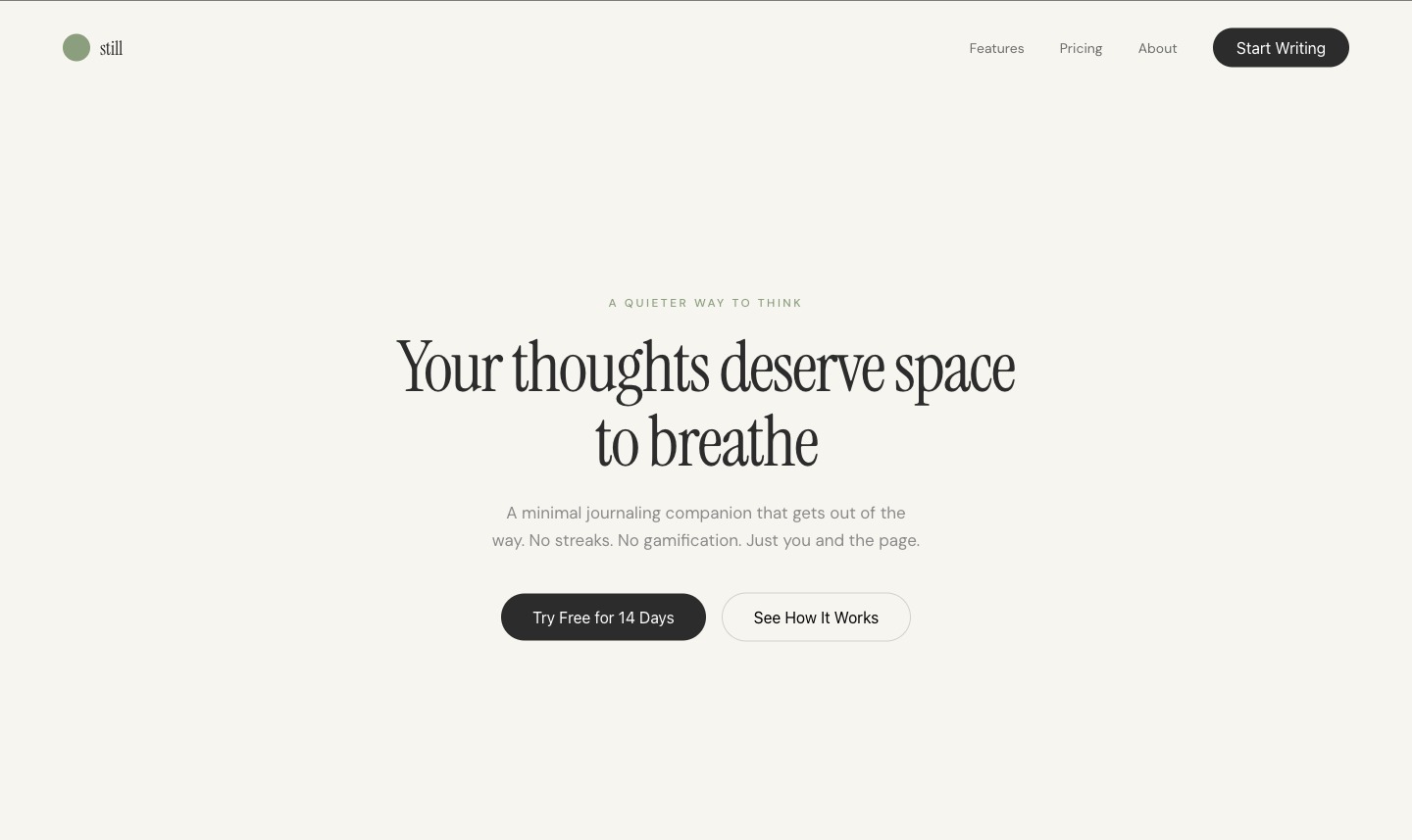
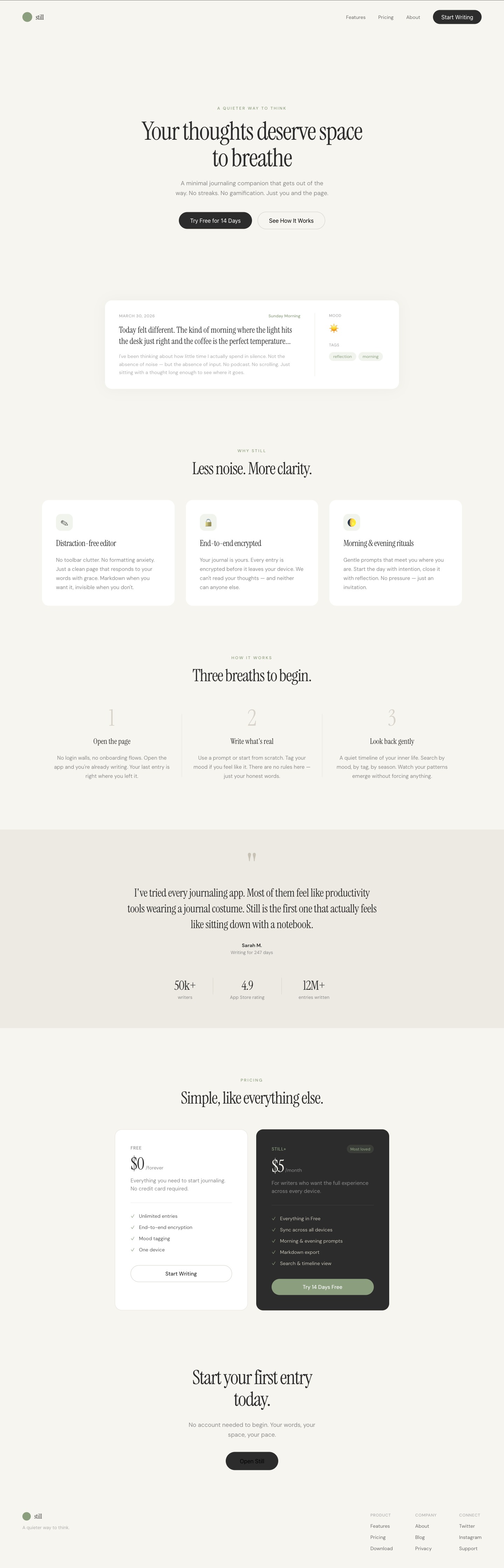
1. Still — Zen Minimal
Off-white, sage green, Instrument Serif + DM Sans. Anti-hustle positioning: "no streaks, no gamification."

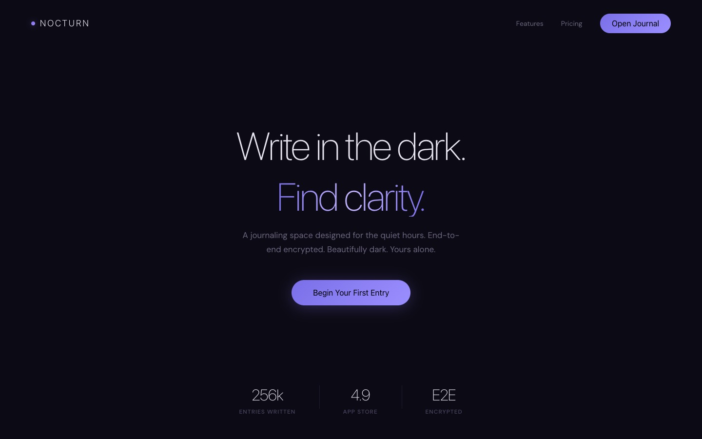
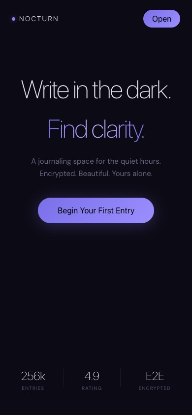
2. Nocturn — Dark Cinematic
Near-black, indigo/purple gradient, ultra-thin SF Pro Display. Night journaling mood with gradient text.
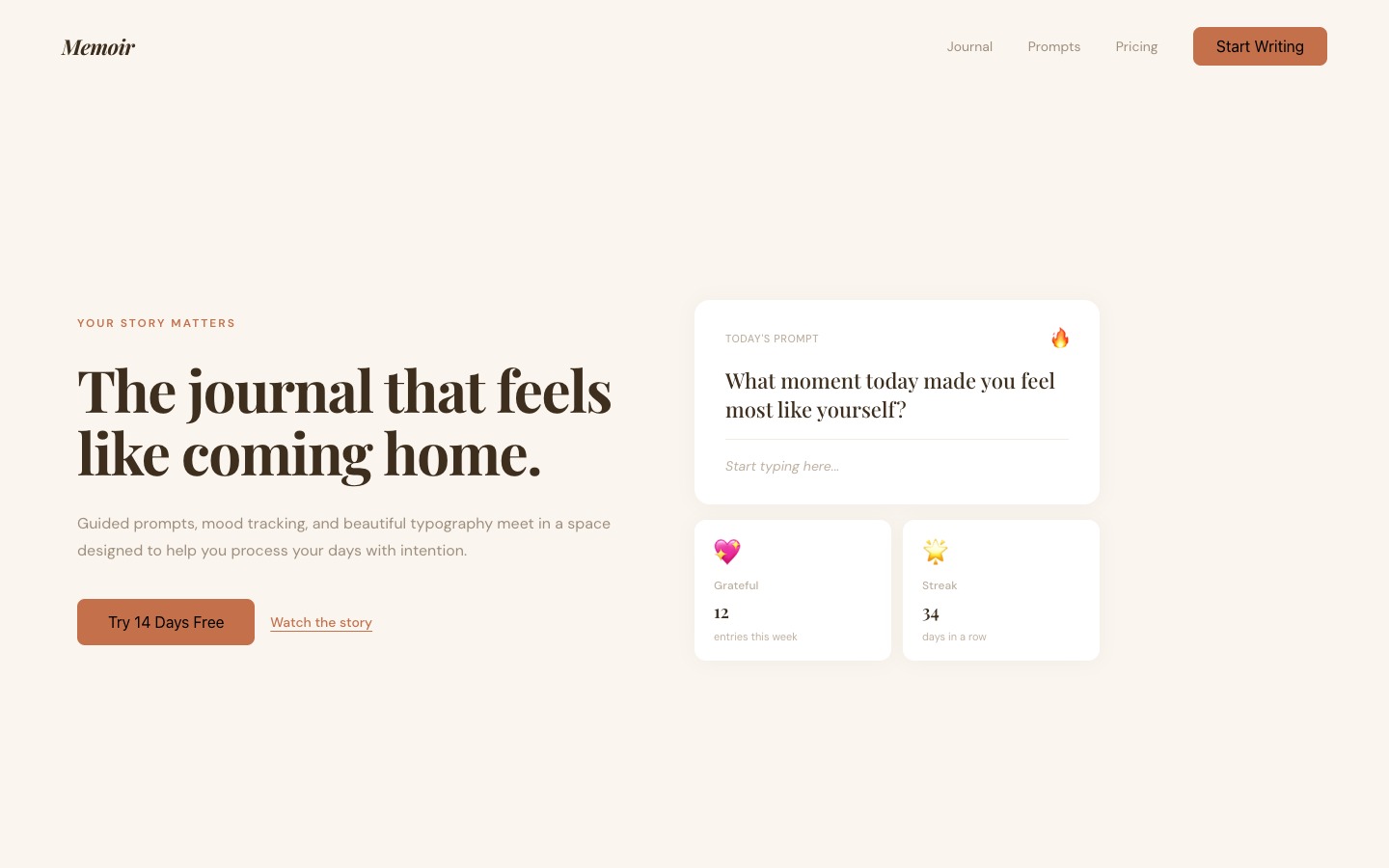
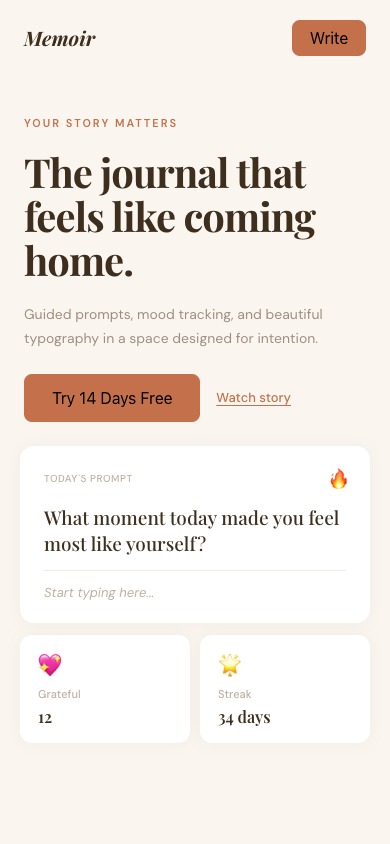
3. Memoir — Warm Editorial
Cream/terracotta, Playfair Display italic. Split layout with guided prompts and mood widgets.
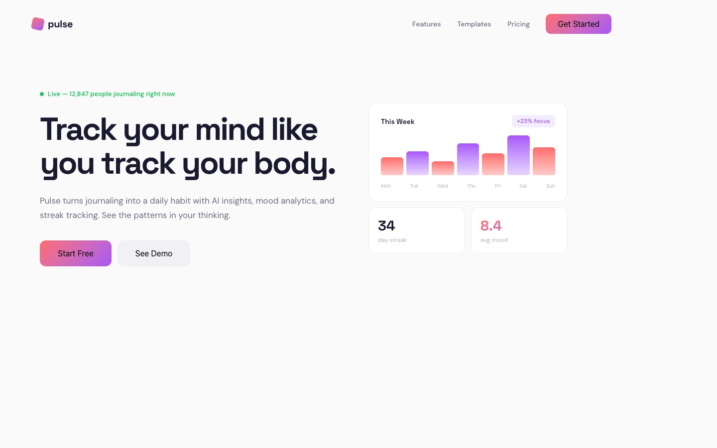
4. Pulse — Bold Futuristic
Clean white, coral-to-violet gradient, Space Grotesk. Data-driven: live counter, weekly chart, mood scores.

Prompt 2: Expand into a full page
I liked "Still" best — the zen minimal concept. So I asked Claude to turn it into a complete landing page:
I like "Still" the best. Expand it into a full landing page (desktop + mobile): hero, features, how it works, testimonials + stats, pricing (free + paid), CTA, footer.Claude expanded both the desktop (1440px) and mobile (390px) artboards with 7 complete sections:
- Nav — logo, links, CTA button
- Hero — "Your thoughts deserve space to breathe" + floating journal card preview
- Features — distraction-free editor, E2E encryption, morning & evening rituals
- How It Works — 3-step flow (open, write, look back)
- Testimonials — editorial quote on warm background band + stats (50k writers, 4.9 rating, 12M entries)
- Pricing — Free tier + Still+ ($5/mo) dark card with "Most loved" badge
- Final CTA + Footer — "Start your first entry today" + 3-column footer links
Here's the full expanded desktop page:
Bonus: From Paper to a live website
Here's where it gets wild. Once you have a design you love in Paper, you can hand it to another Claude Code agent and ask it to build and deploy the site. I did exactly that:
I like the "Still" design the best. Can you turn that into a website and deploy it on Vercel?The agent read the design from Paper, rebuilt it as a Next.js site, and deployed it. The full pipeline looks like this:
- Design in Paper — Claude creates artboards, writes HTML, takes screenshots to self-review
- Pick your favorite — tell Claude which concept you want
- Expand it — Claude adds all the sections for a full landing page
- Deploy — ask Claude to read the Paper design and turn it into a live site on Vercel
The live result: view the deployed site →
Next steps
You now have the full workflow. Here's how to make it yours:
- Try it with your own product — swap "journaling app" for whatever you're building. The prompts work for any website type.
- Reference a specific site — instead of "based on Apple," try "based on Linear" or "based on Stripe." Claude adapts the design language.
- Go deeper on one concept — ask Claude to design inner pages (pricing, about, blog) in the same visual system.
- Deploy it — once you like a design, tell Claude to build and deploy it. The Paper-to-Vercel pipeline takes minutes.
The 2 prompts to copy
Prompt 1 · Explore
Design 4 concept directions for a [your product] — each with a desktop (1440×900) and mobile (390×844). Vary mood, palette, typography, and layout. Apple-level craft. Freestyle everything.Prompt 2 · Expand
Expand [concept name] into a full landing page (desktop + mobile): hero, features, how it works, testimonials + stats, pricing (free + paid), CTA, footer.
Written by
@atareh
AI architect & creator. Writing, designing, and producing in AI and tech. Previously head of product at a healthtech SaaS; background in molecular science. Founded gogray.today in 2017.
Related
Keep reading.
Made by @atareh · x / twitter · instagram