 atareh
Design Systems · APR 14, 2026
How to build a scroll-driven hero shrink animation with 6 prompts
The exact prompts to recreate a full-bleed hero that shrinks into a card on scroll, with flanking collection cards sliding in. Covers the 4-layer fixed positioning architecture, clip-path animation, and the compositing bugs to avoid.
The approach
Most people prompt Claude with something like “build me a landing page” and get a generic Bootstrap-looking result. The problem isn't Claude — it's that you're asking it to make a thousand design decisions with no constraints.
The fix is a design system file. A DESIGN.md that gives Claude specific hex codes, font weights, spacing scales, border radius values, and explicit do's and don'ts. When Claude has these constraints, it stops guessing and starts executing.
With this approach I built a sunglasses brand website with a scroll-driven hero shrink animation, a Nike-inspired monochromatic design system, and full-bleed photography — using 6 prompts and zero Figma. Here's the framework so you can do the same thing.
What you need
- Claude Code — the CLI, desktop app, or claude.ai/code
- getdesign — an npm tool that generates brand-accurate DESIGN.md files (
npx getdesign@latest add [brand]) - Reference screenshots — 1-2 screenshots of animations or layouts you want to recreate
That's it. No Figma, no design tools, no CSS frameworks beyond Tailwind.
The 6 prompts
These are the exact prompts I used. Copy them, swap the product type and brand, and you'll get the same scroll-driven shrink effect with a completely different skin.
Pull a design system
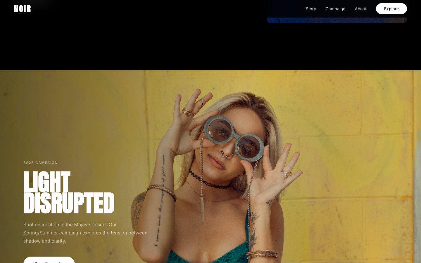
npx getdesign@latest add nikeRun this in your terminal before you even open Claude. It generates a DESIGN.md with the brand's complete visual language — colors, typography, spacing, components, and explicit do's and don'ts. This is the constraint document that prevents Claude from making generic design choices. I used nike for the monochromatic, full-bleed photography style. Try shopify, revolut, stripe, or linear for completely different aesthetics.
Scaffold the site with the scroll animation architecture
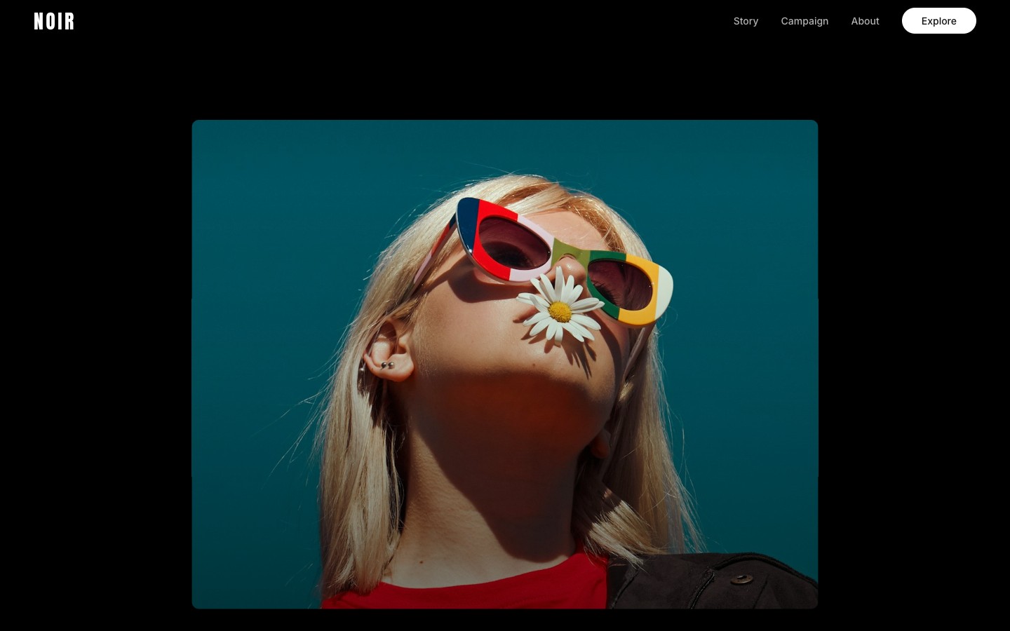
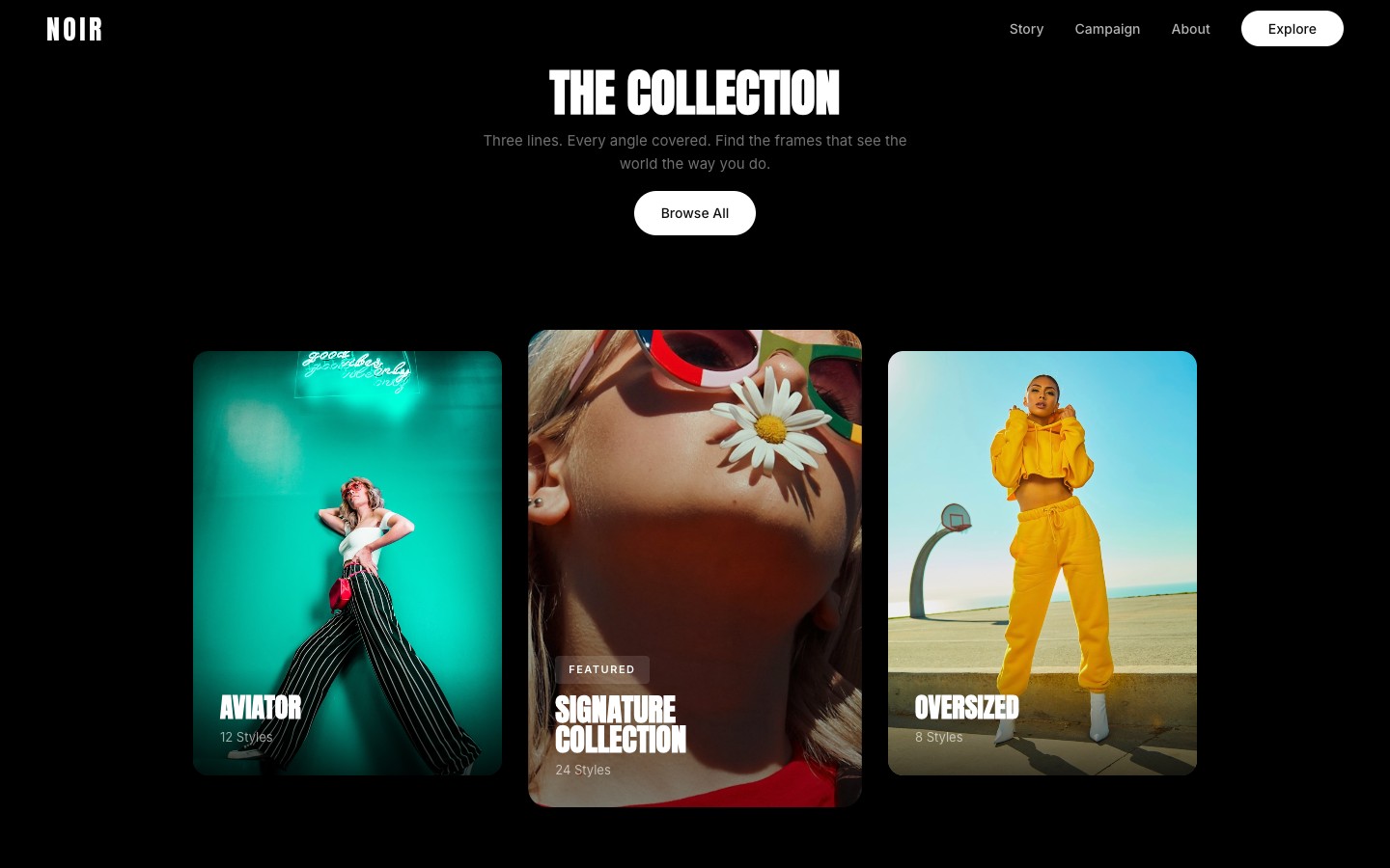
Build a scroll-driven hero animation for a [product type] site using this DESIGN.md. Use 4 separate position:fixed layers stacked by z-index — NOT position:sticky (it breaks z-index in vanilla HTML). The layers: (1) z-index:1 — a cards overlay with a section title at top and 3 image cards in a row (left card, empty center-space placeholder, right card); (2) z-index:2 — the hero background image covering the full viewport; (3) z-index:3 — hero text overlay with headline + subtitle + CTAs; (4) z-index:4 — card content overlay positioned to match the shrunk image bounds. Below the fixed layers, add a scroll spacer div (height: 320vh) then normal-flow content sections with position:relative and z-index:10 so they scroll over the fixed layers.This is the critical architecture prompt. Two things matter: position:fixed siblings (not nested inside a sticky container) and the z-index layer stack. The cards overlay sits behind the hero image. As the hero clips away on scroll, it reveals the cards beneath. The content sections sit on top of everything. If you use position:sticky + overflow:hidden instead, the z-index stacking will break in every browser.
Wire up the shrink animation with clip-path
Animate the hero image shrinking on scroll using clip-path:inset() — NOT top/left/right/bottom positioning, which causes compositing bugs. Calculate scroll progress as scrollY / (vh * 3). Split into 3 phases: Phase 1 (progress 0–0.2) fades out the hero text with opacity and translateY(-50px). Phase 2 (progress 0.1–0.5) shrinks the image via clip-path:inset(T% LR% B% LR% round Rpx) where at full shrink T=38%, LR=38%, B=7%, R=20px — these values match the center-space placeholder bounding box. Phase 3 (progress 0.45–0.75) fades in the section title above and slides the side cards in from translateX(-60px) and translateX(60px). Use easeInOut on Phase 2.The specific numbers matter here. The clip-path inset percentages (38% top, 38% sides, 7% bottom) must match where the center card placeholder sits in the viewport. If the card moves, the clip values need to match. The three phases overlap slightly so the transitions feel fluid — the image starts shrinking before the text fully fades, and the cards start appearing before the image finishes shrinking.
- Why clip-path instead of inset? Animating top/left/right/bottom on an absolutely positioned element promotes it to a compositing layer in Chrome, which breaks z-index stacking with non-composited siblings. Your cards will be invisible behind the hero no matter what z-index you set.
- Why position:fixed instead of sticky? position:sticky + overflow:hidden creates a stacking context. All children share it, so z-index stops working between the absolute hero image and the relative card elements.
Set up the content transition
After the scroll spacer (320vh), place all remaining sections inside a wrapper div with position:relative, z-index:10, and background:#000. This lets the content scroll naturally over the fixed hero layers. In the scroll handler, set visibility:hidden on all fixed layers when scrollY exceeds vh*3.3 so they don't interfere. Use IntersectionObserver with threshold:0.01 and rootMargin '0px 0px 100px 0px' for reveal animations — low threshold so fast scrolling doesn't skip sections.The spacer height (320vh) controls how long the user sits on the card layout before the content starts scrolling up. Too short and the cards barely appear before getting covered. Too long and there's dead scroll space. 320vh gives the animation time to complete at ~75% progress, then a comfortable pause before content starts at 100%.
Fix the image focal point
The hero image needs object-fit:cover with object-position:center 15% so the model's face stays centered both at full-bleed AND when clip-path shrinks the visible area. The clip crops from all edges toward center — if the face is vertically centered in the original frame, it becomes the focal point of the shrunk card. Adjust the percentage: lower values (10-20%) push focus toward the head.This is the subtle detail that makes or breaks the effect. When the image is full-bleed, object-position centers it for the hero state. When clip-path crops it down to a small card, the same object-position determines what's visible in that card. You want the model's face centered in both states. Test by setting the clip to its final value and tweaking the percentage.
Retheme with a different brand
Change this from a [current product] to a [new product] and apply this branding: npx getdesign@latest add [new-brand]. Keep the scroll animation architecture (fixed layers, clip-path shrink, 3-phase timing) but retheme all colors, typography, content, and imagery.This is the power move. I built the grocery site with a Shopify design system, then rethemed it into a sunglasses brand with a Nike design system in one prompt. Claude rewrites colors, fonts, content, and image styles while preserving the scroll animation skeleton. The architecture is product-agnostic — only the visual layer changes.
Why this works
Three ideas make this framework effective:
Constraints produce better output than freedom. When you give Claude a blank canvas, it makes safe, generic choices. When you give it a DESIGN.md that says “zero shadows, pill buttons at 9999px radius, font weight 330 only” — it produces something with a point of view. The design system is the taste you're injecting.
Separation of structure and skin. The layout, animations, and component architecture are independent from the visual identity. This is why prompt 6 works — you can retheme a Revolut-styled fintech page into a Shopify-styled grocery app in one prompt. Build the skeleton first, then dress it.
Screenshots beat descriptions. Natural language is lossy for visual communication. When you say “a card that slides in”, Claude has to guess the size, timing, easing, and direction. When you attach a screenshot, it has the answer. Use screenshots for anything visual — animations, layouts, spacing, color relationships.
Make it yours
The framework is modular — swap any piece:
- Different brand:
npx getdesign@latest add stripegives you Stripe's gradient-heavy, light-mode design language - Different product: “SaaS analytics dashboard” or “travel booking platform” changes all the content while the visual system stays
- Different animation: Find a scroll animation you like on any site, screenshot it, and use prompt 3
- Stack it: Run prompts 1-5 with one brand, then prompt 6 multiple times with different brands to generate a portfolio of variations
Get the source code
If you want to skip the prompting and just clone the result — the full Next.js codebase is available. Every component, the scroll animation system, both DESIGN.md files (Revolut and Shopify), and the complete Tailwind setup.
$7.99
one-time · Next.js + TypeScript + Tailwind
Get the themeScroll animation · Dark design system · Responsive · All components · Both DESIGN.md files · MIT license
Next steps
- Run
npx getdesign@latest add [brand]with a brand you like and try the 6-prompt framework - Grab 2-3 screenshots of scroll animations from sites you admire for prompt 3
- Start with a product you know well — the more specific the product context, the better Claude's content generation
- Deploy to Vercel when you're happy — the whole thing is static, so it's free hosting
Written by
@atareh
AI architect & creator. Writing, designing, and producing in AI and tech. Previously head of product at a healthtech SaaS; background in molecular science. Founded gogray.today in 2017.
Related
Keep reading.
Made by @atareh · x / twitter · instagram